Name the job in the hero
Clear the fifty-millisecond trust gate so attention switches on at all.
“The right vacuum sealer for how you actually use it.” Category and who-it-is-for land in the same instant the logo does, before the shopper reads.
Work / 04
Online store for vacuum sealers, bags and processing equipment
A specialist store I rebuilt in 2019 and still run. The redesign keeps everything that works and is built so the first thirty seconds show it.
Store rebuilt 2019 and run since · redesign proposed June 2026 · store captured 2026-03-28, proposal 2026-10-06
Published with Vacuum Sealers Unlimited’s permission.
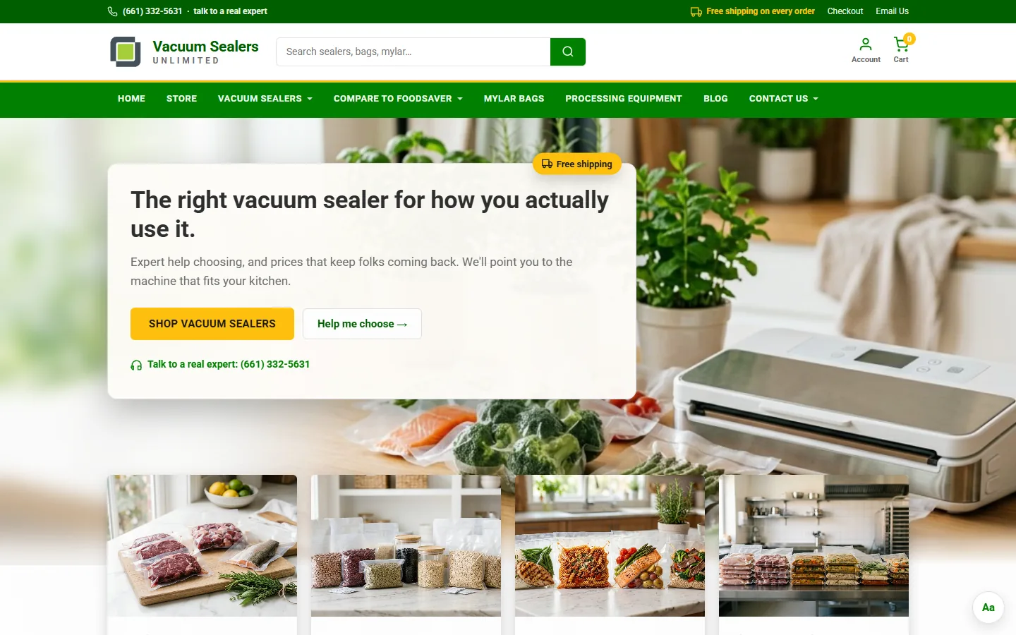
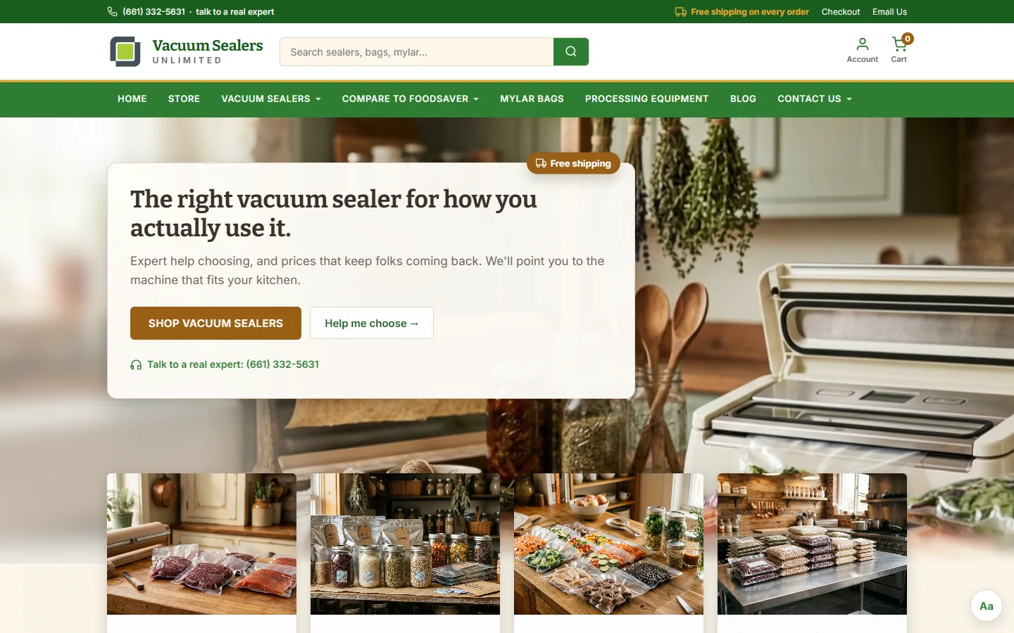
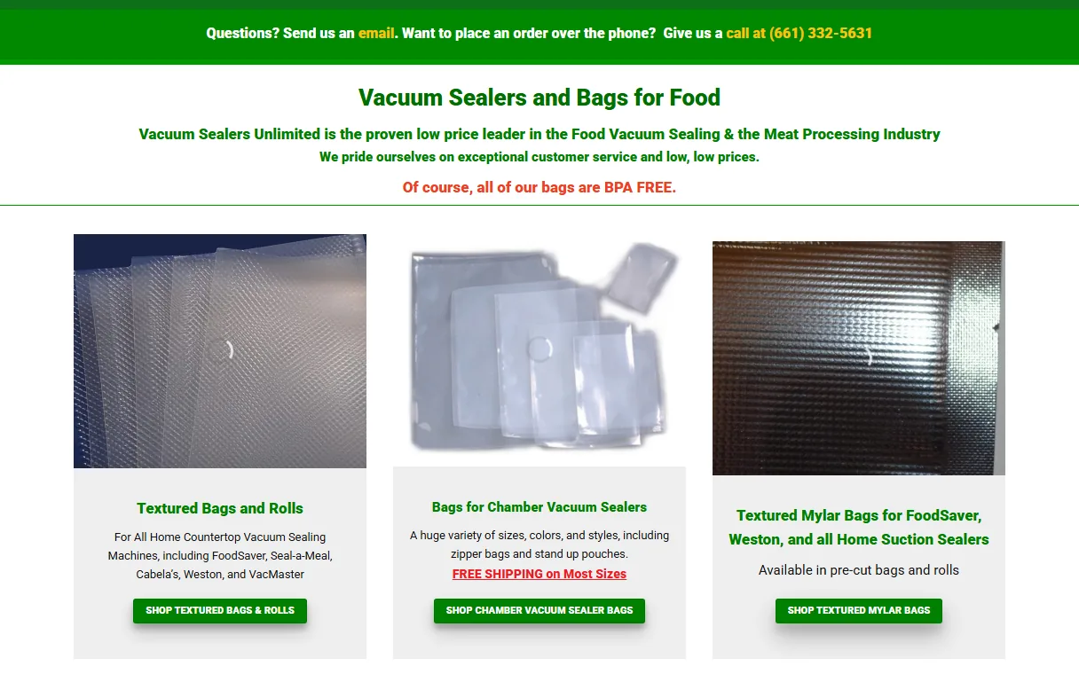
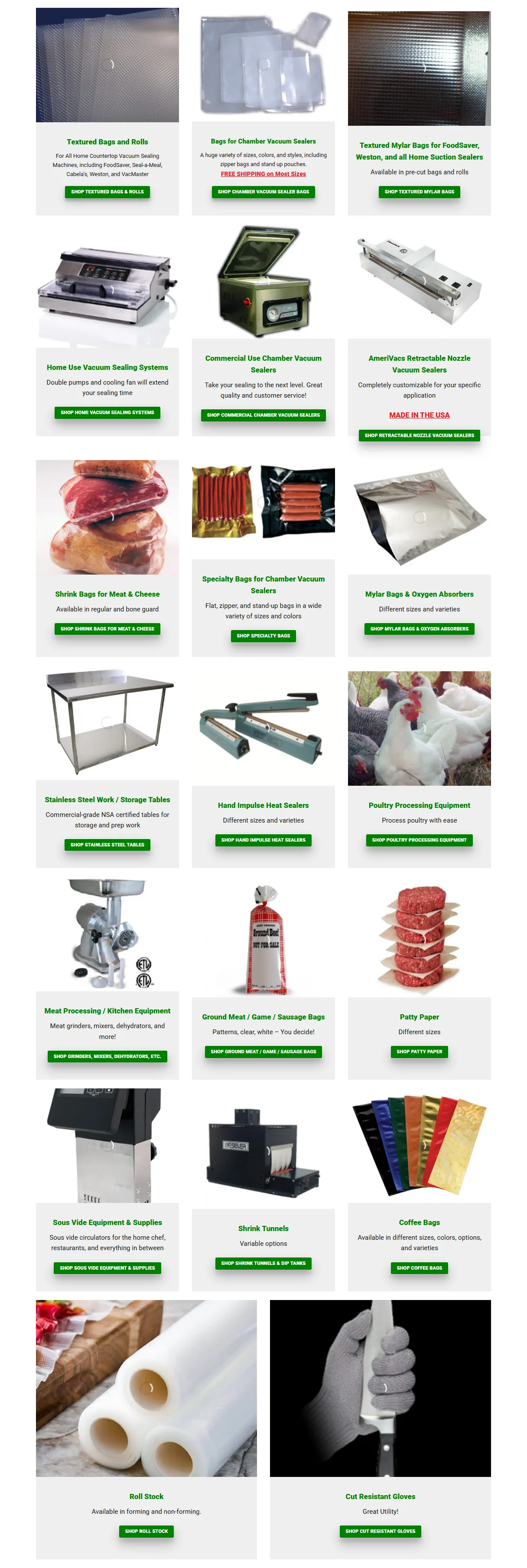
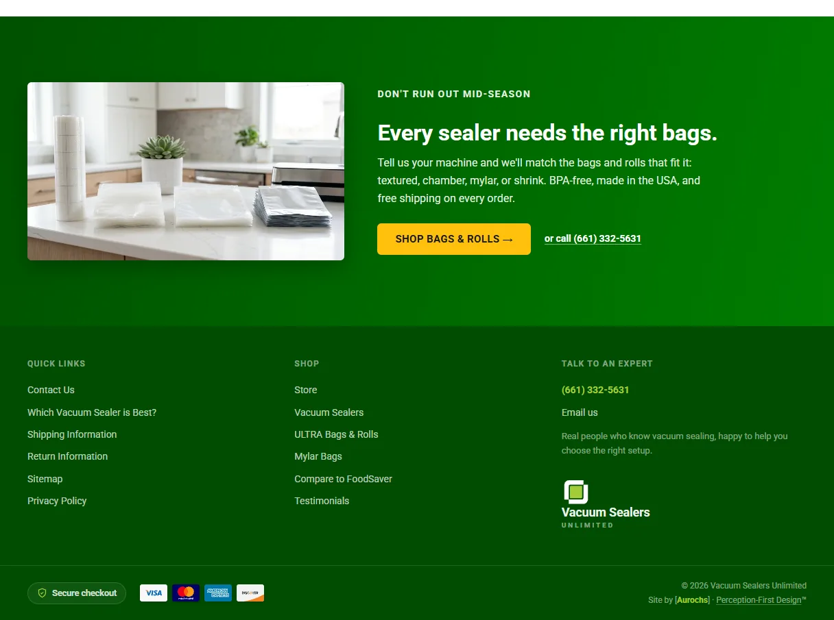
Left: the live store’s homepage, on my 2019 build, captured 2026-03-28. Right: the proposed homepage in its first theme, Invisible, captured 2026-10-06 at the same size.
The scene photos in the proposal are generated stand-ins; the product photos are the store’s own.
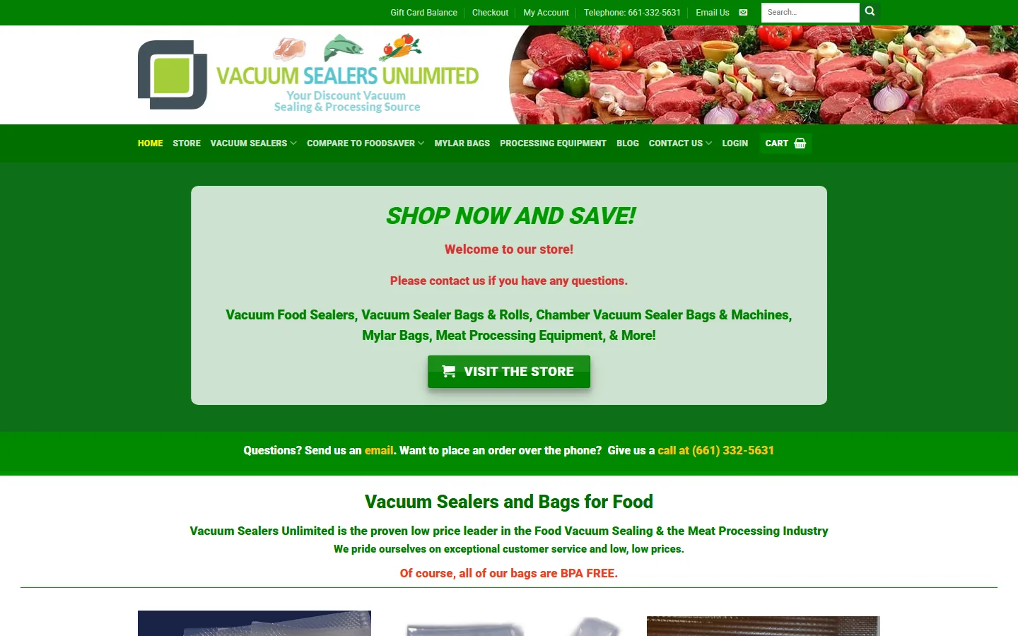
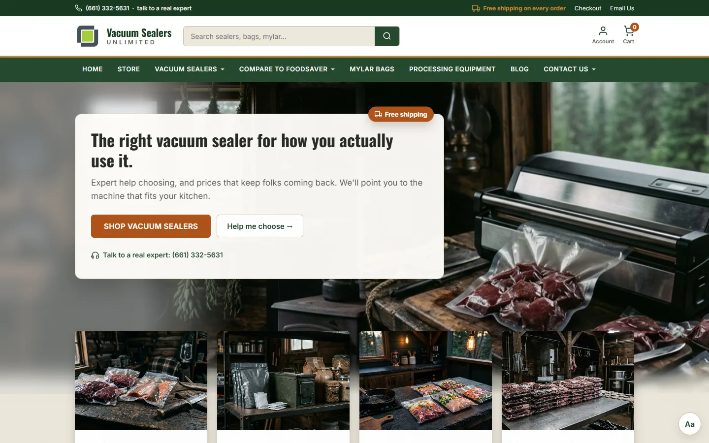
The redesign I proposed in June 2026, online as a prototype. Its Aa button switches between the three themes.
What the design aimed for
Pre-verbal arousal: the nervous system registering trust, relevance, and forward momentum before the analytical mind engages.
For Vacuum Sealers Unlimited: a first-time shopper feels “calm, capable, in good hands” within the first few seconds.
Checkpoint 01 · First 50 milliseconds
The shopper has not read a word. The page registers as either “a real place to buy the right machine” or “something to scroll past,” and the verdict is hard to reverse.


Decisions
Clear the fifty-millisecond trust gate so attention switches on at all.
“The right vacuum sealer for how you actually use it.” Category and who-it-is-for land in the same instant the logo does, before the shopper reads.
Clear the fifty-millisecond trust gate so attention switches on at all.
Structure the page so the right action is the easiest action.
“Expert help choosing, and prices that keep folks coming back.” Then one primary action, and a quieter “Help me choose” for the shopper who wants to be walked through it.
What it was built to change
Warm referral traffic recognizes the store on arrival. Cold traffic gets the category right on the first glance, without the page having to explain itself.
Paste-ready line
“The first fifty milliseconds decide whether a shopper stays.”
Checkpoint 02a · First 30 seconds
The shopper has decided to keep looking. Now they need a sign a real person stands behind the counter, and a way to see their own situation in what the store sells.


Decisions
Design for what the reader actually does, not what they would say they want in a focus group.
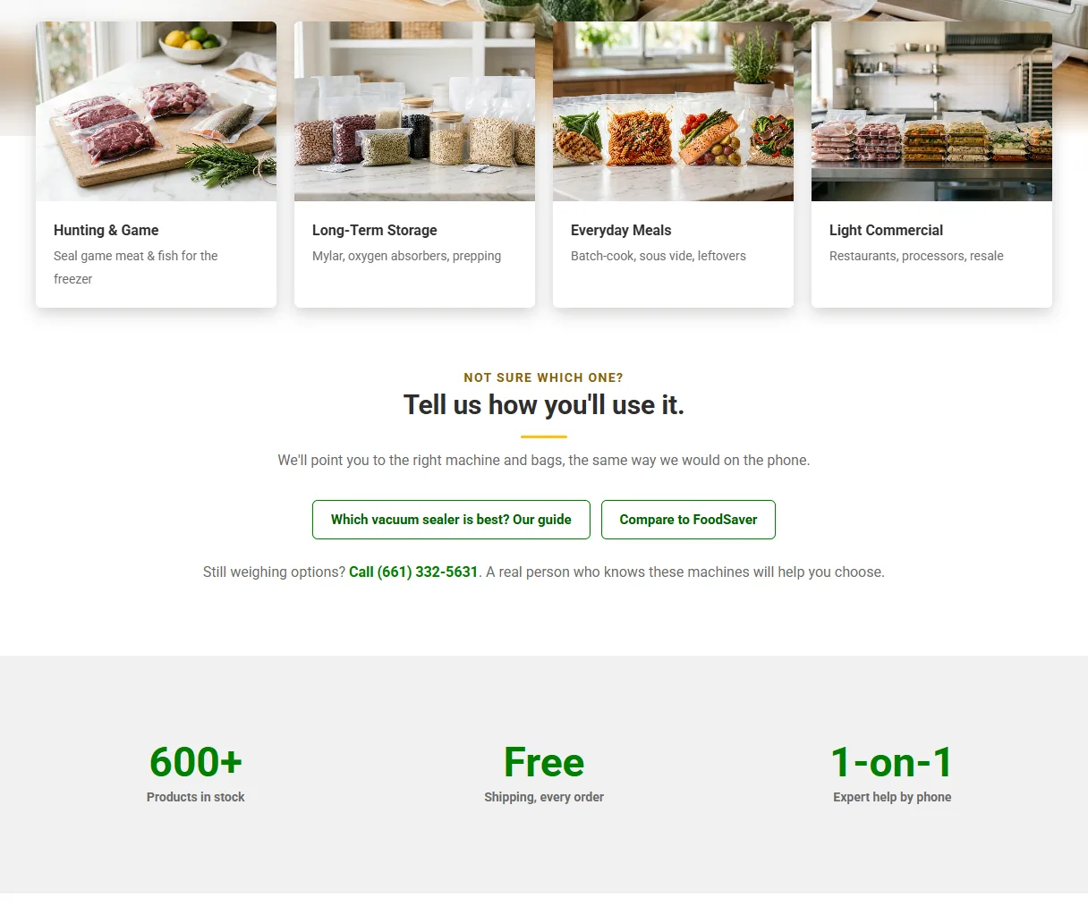
Hunting and game, long-term storage, everyday meals, light commercial, so a shopper sees their own situation.
Design for what the reader actually does, not what they would say they want in a focus group.
The phone help is the one thing a big-box site cannot copy.
What it was built to change
Shoppers self-qualify inside the first half-minute. The right ones read on with “is this for me?” already answered, which is exactly the moment expert help converts a browse into an order.
Paste-ready line
“Trust is a perception before it is a judgment. The page earns it in the first thirty seconds, or not at all.”
Checkpoint 02b · Finding the right machine
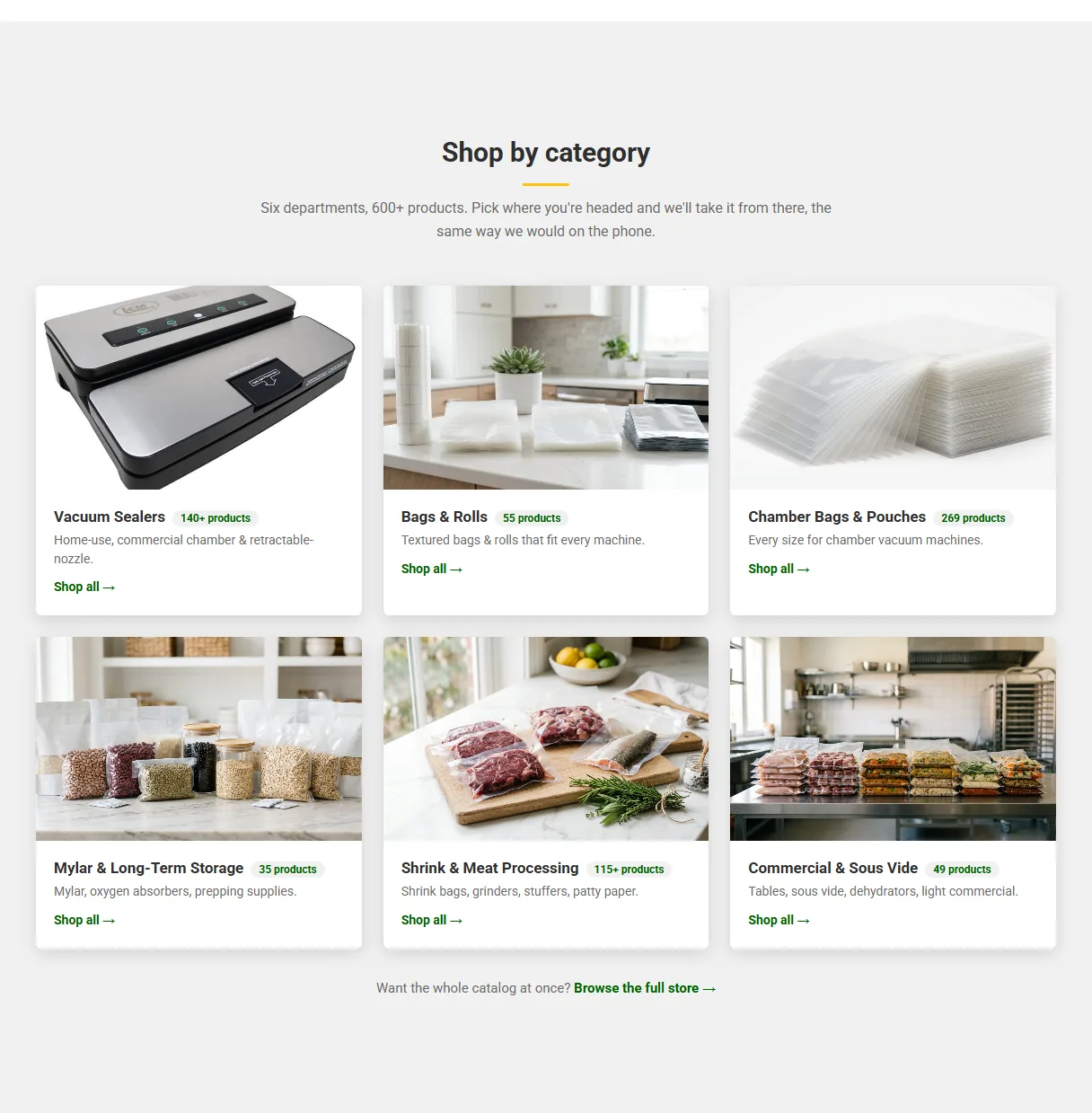
This is the moment that costs completed sales. When there are too many doors, people stop choosing and leave. It is also the highest-leverage fix on the site.


Decisions
Free the working memory the reader needs to process the page at all.
Structure the page so the right action is the easiest action.
Product counts stay as a breadth signal, and the full catalog sits one click away on the shop page.
What it was built to change
The homepage goes from a wall to six clear doors. The breadth still shows, as counts, which is selection proof rather than a tax. The uncertain buyer, the one most likely to call or to leave, finally has an obvious first move.
Paste-ready line
“Selection is an asset. A wall of it is a tax.”
Checkpoint 03 · The whole visit
Trust is cumulative. Every section that shouts for attention spends a little of it, until nothing leads and the shopper is the one left to figure out what matters.


Decisions
Structure the page so the right action is the easiest action.
Gold is reserved for the single primary step; everything else steps back to quieter weights.
Free the working memory the reader needs to process the page at all.
Structure the page so the right action is the easiest action.
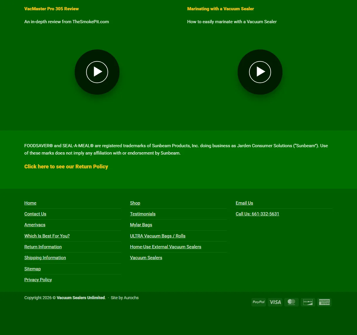
Trimmed to what people actually look for at the bottom of a page, instead of a second copy of the navigation.
What it was built to change
The page has one clear first action and a calm place to land. The eye always knows where to go next, and the trust built early in the visit is still intact by the time the shopper reaches the cart.
Paste-ready line
“Calm is not the absence of energy. It is energy pointed at one thing.”
The method
Free the working memory the reader needs to process the page at all.
Clear the fifty-millisecond trust gate so attention switches on at all.
Make the page easy to read so the content feels true.
Design for what the reader actually does, not what they would say they want in a focus group.
Structure the page so the right action is the easiest action.
Result
Online as a working prototype: one theme in the store’s own colors and type, two new directions.
Since my 2019 rebuild, the store has grown, quadrupling revenue to $5M+ annually.
For branding, brand development and marketing strategy.