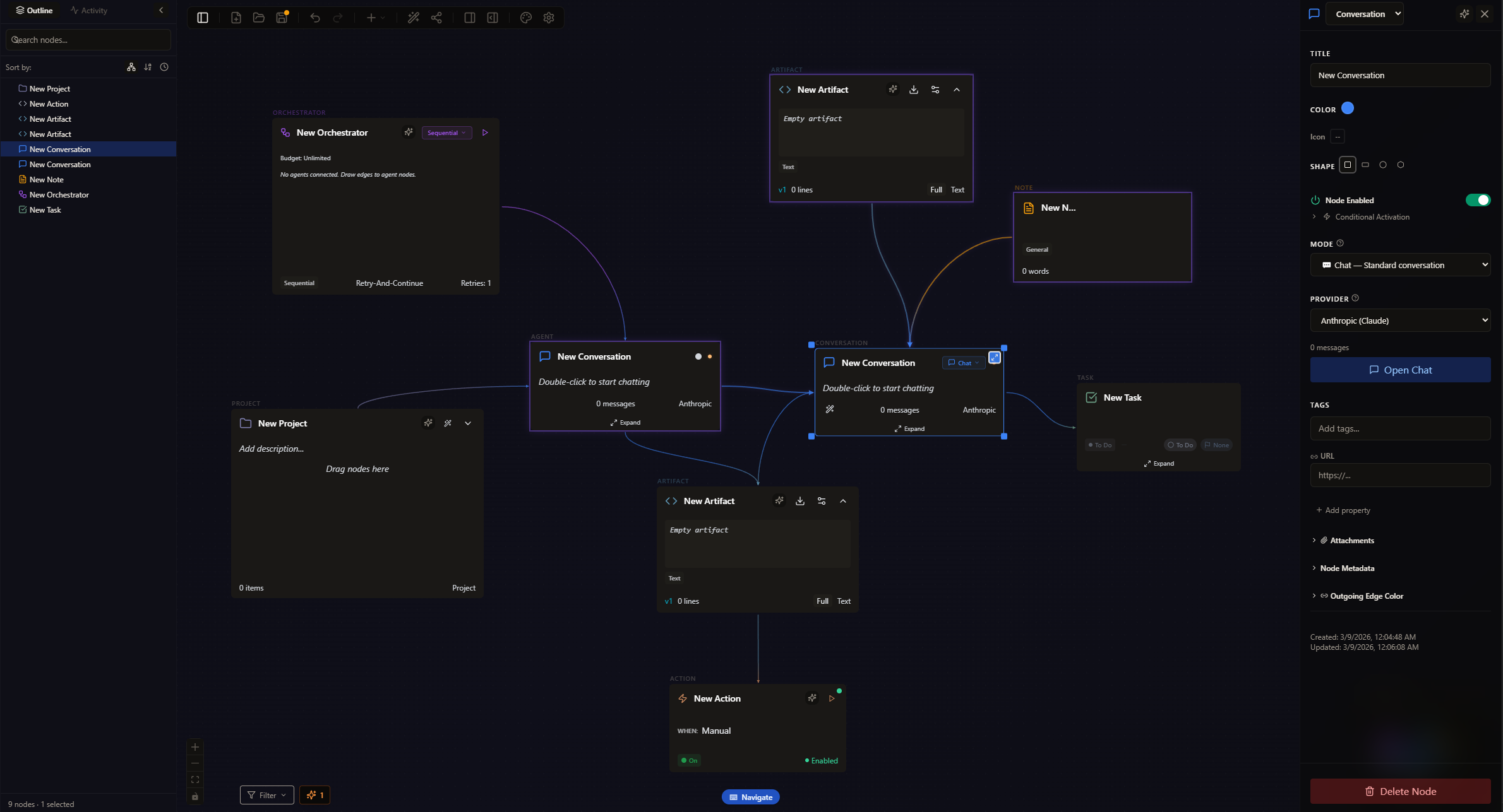
Psychology-Informed Web Design Framework
Five layers. One goal.
| Layer |
Principle |
Research Base |
Causal Chain |
| Layer 0: Cognitive Load |
Reduce decision fatigue |
Sweller (1988) |
Less thinking → more action |
| Layer 1 |
Design for 50ms judgments |
Lindgaard et al. (2006) |
Trust forms before content loads |
| Layer 2 |
Easy to process = trustworthy |
Reber & Schwarz (1999) |
Fluent design → perceived credibility |
| Layer 3 |
Design for behavior, not stated preferences |
Kahneman (2011) |
Emotional resonance → action |
| Layer 4 |
Structure choices to guide behavior |
Sunstein & Thaler (2008) |
Clear path → completed purchase |
See the full framework with all citations: PFD Reference →
“Can’t perceive anything without the bandwidth to do so.”
Cowan’s research shows working memory holds 3 to 5 chunks, not Miller’s famous 7. Every unnecessary element on your page is stealing from that budget.
Recent research adds a second path: when intrinsic interest is high enough (Dodson’s Interest-Based Nervous System: passion, novelty, challenge, urgency), it can override load ceilings. Cognitive load is not just “reduce friction.” It is “reduce friction or increase the reason to push through it.”
In practice: reduce choices at each step, show only what’s needed now, use smart defaults for 80% of users, and eliminate unnecessary fields, steps, and decisions.
Causal chain: Fewer choices → less mental effort → faster decisions → more conversions.
Simply Smart Home: Site presented “very matter-of-fact statements and not much else.” Users had to work to figure out what the product did or why they’d want it. Restructured content to answer the questions users actually have: what is this, who is it for, why should I care. Before they have to ask.
Read more: Cognitive Load →
Read the mechanism
“Users form first impressions the same way on sites as they do with people in real life, and you have a split second to make your best one.”
You have 50 milliseconds to pass the “is this trustworthy?” test. The threshold isn’t world-class. It’s “not sketchy.” If your site triggers the alarm, they’re gone before conscious thought kicks in.
Hero sections that immediately communicate value. Strategic use of faces, the only thing humans pattern-recognize from birth. Visual quality consistent with price point. Color and typography that signal the right personality.
Causal chain: Faces in hero → instant pattern recognition → positive emotional response → trust established before thinking begins.
Simply Smart Home: Added smiling faces in hero product graphics: smart frames displaying family photos. Faces are the only thing humans pattern-recognize from birth. Drove direct conversions and brand awareness; visitors felt warmth, not “another gadget.”
iO Theater: Hobbyist WordPress site triggered the “this doesn’t look like a real theater” alarm. Clearing that perception barrier alone moved online ticket sales from 50% to 75%.
Read more: The 50-Millisecond Verdict →
Read the mechanism
“They wouldn’t take this business seriously because they don’t do so on their website.”
Reber and Schwarz showed that experiences which feel easy to process are judged as more trustworthy, more beautiful, and more true. Fluency is not simplicity. It is cognitive ease.
Clean typography with adequate contrast. Predictable layouts that match mental models. Unified branding and collateral. No mixed signals.
Causal chain: Unified branding → feels professional → perceived as trustworthy → clears the “would I buy from this?” bar.
Simply Smart Home: Basic template, no branding system, $150+ price point. Customers “wouldn’t take this business seriously.” Created unified brand system and style guide. Perceived quality matched price point. Price objections decreased, vendors became more interested.
Competitor insight: “Aura frames put weights in their frames to make them feel less cheap and charge more.” Perception of quality is manipulable.
Read more: The Feeling of Truth →
Read the mechanism
“Protect the customer from internal stakeholder preferences.”
Design for how people actually behave and feel, not what they say or what features do. Research behavior, not stated preferences. Find the emotional core: what do they feel after using this?
Audit messaging: is it feature-focused or outcome-focused? Compare survey data vs. analytics. The gap is where perception bias lives.
Causal chain: Emotional tagline → connects to real desire → resonates with target customer → action.
Simply Smart Home: Marketing focused on screen resolution, WiFi, app features. Workshopped the team through “what does this product actually do for the user emotionally?” Discovery: it’s about connection, not technology. Tagline: “Stay connected, even when you’re apart”, which Aura later stole. Best validation possible.
Read more: The Gap →
Read the mechanism
“They’re hunters looking for prey, and it’s my job to make a trail for them.”
Structure choices to guide behavior. Navigation should reflect user goals, not org charts. Make the desired path the obvious path.
Strategic default selections. Show the premium option first so the standard feels like a deal. Reduce choice paralysis through smart categorization. Put your CTA where decisions naturally happen.
Causal chain: Clear path → user finds goal → reduced friction → purchase completed.
Simply Smart Home: Homepage “didn’t answer any of the user’s questions, goals, or form a good impression.” Rebuilt as a trail: visitor lands → sees emotional hook (faces, connection) → understands product → sees social proof → clear path to purchase.
Read more: The Trail →
Read the mechanism
These five layers draw from two largely distinct bodies of cognitive science: perception psychology and ADHD cognitive neuroscience. Connected here for the first time. The full citation set and layer mapping are in the complete reference.