Methodology Work Services Book About Writing Make Me Think - chapters Methods Guide Notes Blog FAQ

Work / 02

02Demo rebuild

Simply Smart Home

Smart digital frames and lighting automation

Their homepage, rebuilt on their own style guide so the page frames each photograph the way their frames do.

June 2026 · captures taken 2026-10-06
Published with Simply Smart Home’s permission.
Before Aurochs, I led design at Simply Smart Home from 2019 to 2025. This is the homepage I wanted to build while I was there.

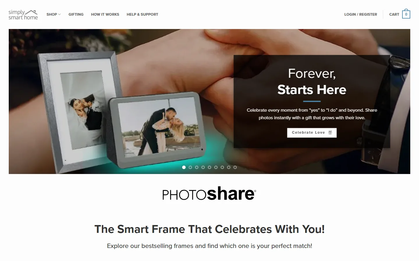
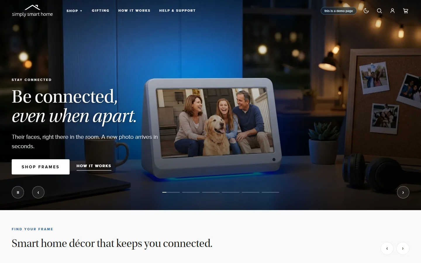
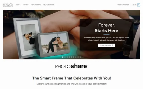
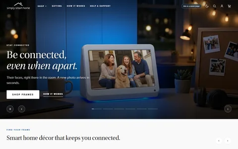
mysimplysmarthome.com desktop first screen, captured 2026-10-06, on the first slide of its hero: Forever, Starts Here, with a Celebrate Love button.The demo desktop first screen on the first slide of its hero: Be connected, even when apart, beside a frame on a desk at night, with Shop Frames and How it works.

Left: mysimplysmarthome.com as it loads today, my earlier work for them. Right: the demo. Both on the first slide of their hero, captured the same day at the same size.

The lifestyle photographs in the demo were generated from their own product images.

The demo homepage itself. Its product links go to their real store.

What the design aimed for

Pre-verbal arousal: the nervous system registering trust, relevance, and forward momentum before the analytical mind engages.

For Simply Smart Home: a gift-buyer registers “a calm, real place that sells lovely frames” in the first second.

Checkpoint 01 · The first glance

“What is this, and is it worth a moment of my time?”

The buyer has not read a word yet. In the first second, the page registers either as “a calm, real place that sells lovely frames” or as “another busy site to scroll past.”

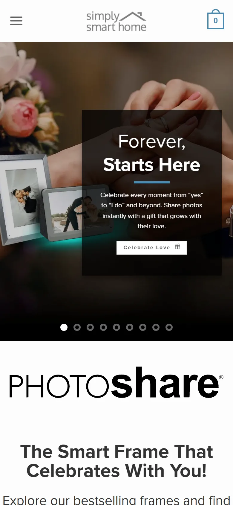
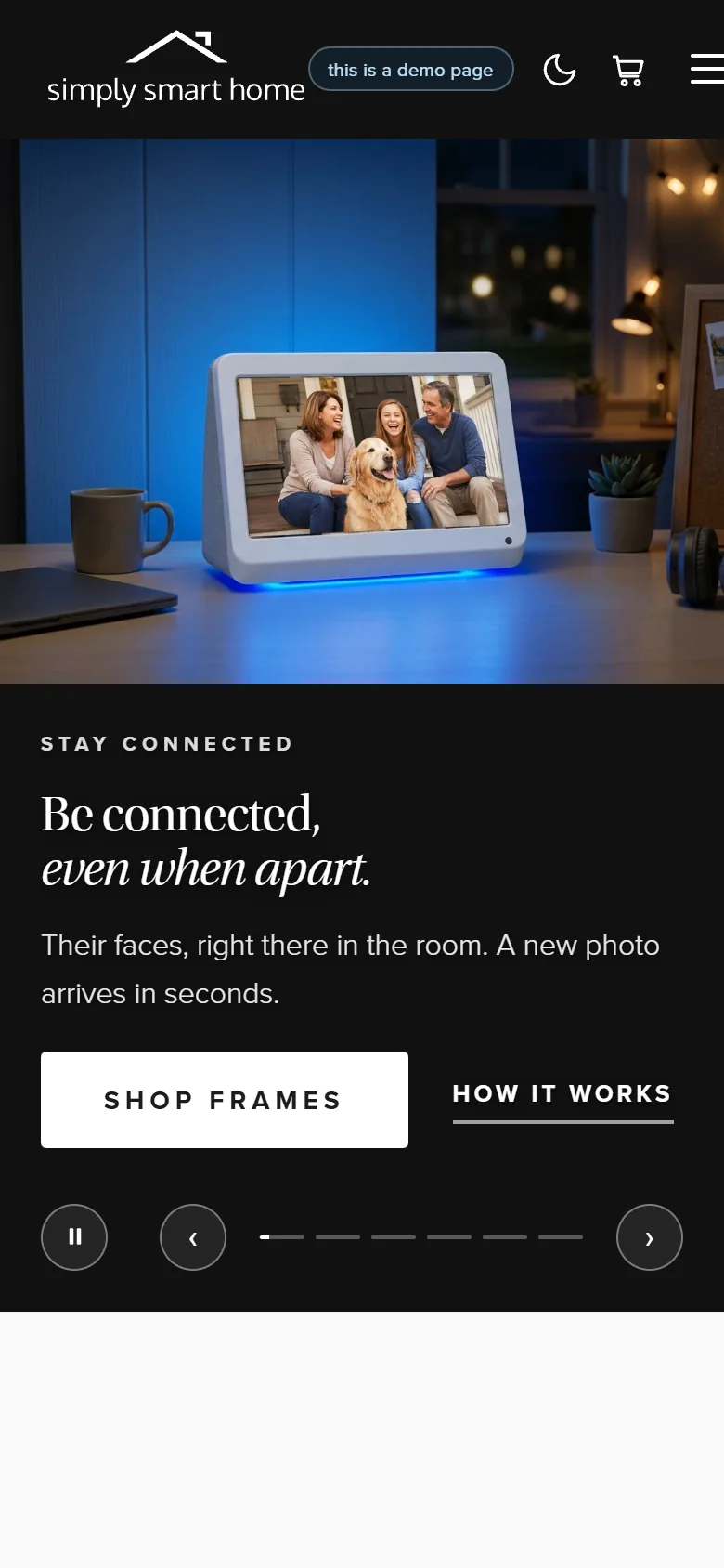
mysimplysmarthome.com first screen on a phone, captured 2026-10-07: Forever, Starts Here, with a Celebrate Love button.The demo first screen on a phone: Be connected, even when apart, with Shop Frames and How it works.
  1. mysimplysmarthome.com desktop first screen, first of four moments: Forever, Starts Here, with Celebrate Love.
    Before · 1
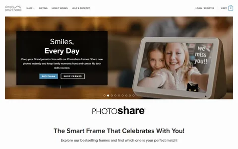
  2. mysimplysmarthome.com desktop first screen, second moment: Smiles, Every Day, with Gift Frame and Shop Frames.
    Before · 2
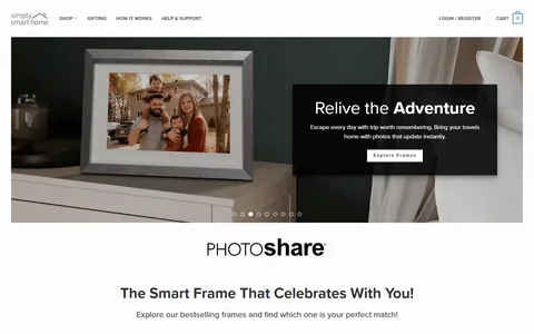
  3. mysimplysmarthome.com desktop first screen, third moment: Relive the Adventure, with Explore Frames.
    Before · 3
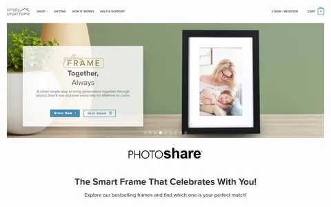
  4. mysimplysmarthome.com desktop first screen, fourth moment: Together, Always, with Order Now and Give Smart.
    Before · 4
  5. The demo desktop first screen, first of three slides: Be connected, even when apart, with Shop Frames and How it works.
    After · 1
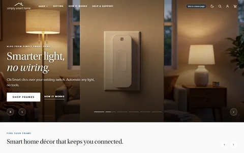
  6. The demo desktop first screen, second slide: Smarter light, no wiring, with Shop Frames and How it works.
    After · 2
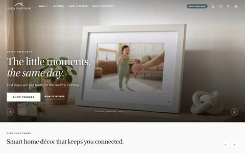
  7. The demo desktop first screen, third slide: The little moments, the same day, with Shop Frames and How it works.
    After · 3

The slider: the same two first screens on a phone, captured 2026-10-07. The frames: each desktop first screen as it turns, in order, their store’s row first: four of their banners, then the demo’s first three slides, captured 2026-10-06.

Decisions

The site is the matte; the photo is the print

L1 First-Impression Architecture

Clear the fifty-millisecond trust gate so attention switches on at all.

L2 Processing Fluency

Make the page easy to read so the content feels true.

The 2021 style guide I wrote for them: “Colors should be restricted to product photos and graphics. Styling is grayscale, preferring solid black and dark grays.” The demo keeps type and buttons black, white and gray, with one restrained blue accent, so the color on screen comes from the photographs.
The same button on every slide

L4 Decision Architecture

Structure the page so the right action is the easiest action.

L0 Cognitive Load

Free the working memory the reader needs to process the page at all.

“Shop Frames”, with “How it works” beside it, sits outside the slides, so it stays put while the headline and photo change. Their hero gives each banner its own buttons.

What it was built to change

Within the first second, the page reads as calm, considered, and warm, a place that sells beautiful frames.

Paste-ready line

“The first second decides whether the buyer stays.”

Checkpoint 02 · Trust

“Can I actually trust this?”

The buyer wants this, and now the careful part of the mind steps in. Is the company real, is the product good, and what does it actually cost to keep, in money and in privacy?

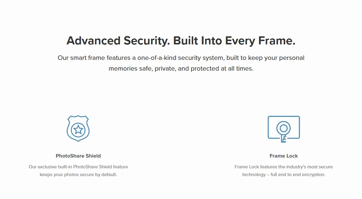
mysimplysmarthome.com today: the Advanced Security section, with PhotoShare Shield and Frame Lock.
BeforeTheir store today: the security section of their homepage. Captured 2026-10-06.
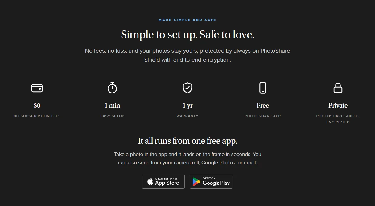
The demo: Made simple and safe, with $0 in subscription fees, one-minute setup, a one-year warranty, the free PhotoShare app, and PhotoShare Shield, encrypted. Gold markers 1 and 2 point at the decisions below.
AfterThe demo: fees, setup, warranty, the app and privacy in one band.

Decisions

1

No subscription fees, said on the homepage

L3 Perception Bias Optimization

Design for what the reader actually does, not what they would say they want in a focus group.

Their product pages say “No Subscriptions or Fees”; their homepage doesn’t. In the demo, $0 in subscription fees is the first item in the band, before setup, warranty and the app.

2

Security folded into the same band

L3 Perception Bias Optimization

Design for what the reader actually does, not what they would say they want in a focus group.

Their homepage gives security a section of its own. The demo puts PhotoShare Shield and encryption in the same row as fees, setup, warranty and the free app.

What it was built to change

The two questions that quietly kill this sale, “will this cost my parent money every month” and “are our photos safe,” are answered before the buyer has to ask.

Paste-ready line

“A nervous buyer does not ask their fears out loud. They just leave. So the page answers them first.”

Checkpoint 03 · Choosing and buying

“How do I choose the right one, and buy it?”

The buyer is convinced. Now they have to pick a model and a finish, and not feel lost doing it. This is the moment choice overload can stall a ready buyer into “I will decide later,” which usually means never.

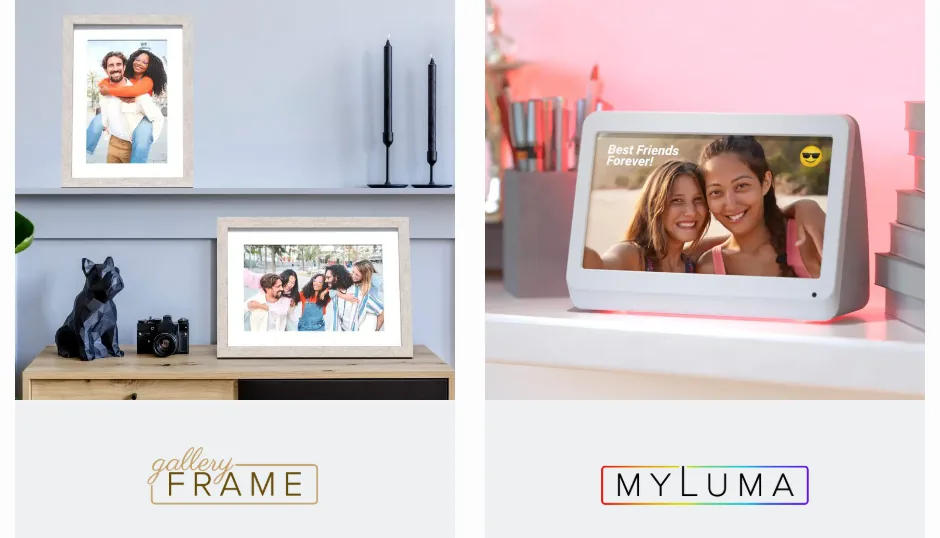
mysimplysmarthome.com today: two bestseller cards, the Gallery frame and MyLuma, each a photograph over a logo.
BeforeTheir store today: the bestseller block (“Explore our bestselling frames and find which one is your perfect match!”), two of its three cards. Captured 2026-10-06.
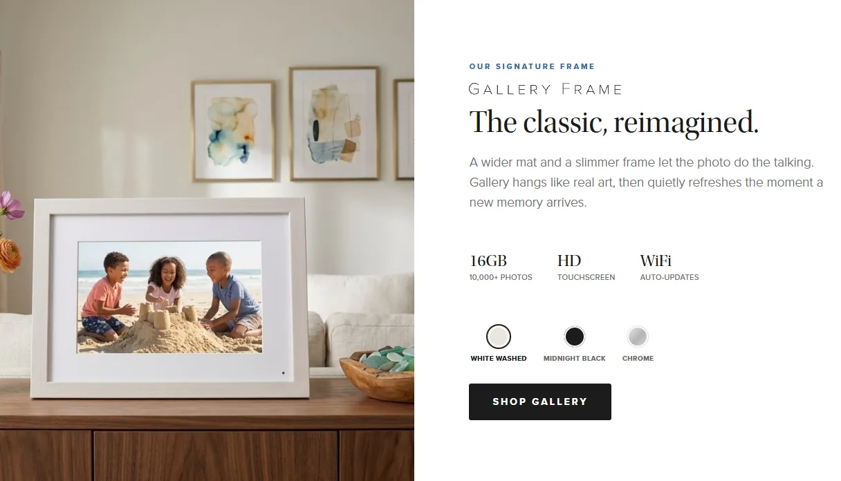
The demo: Our signature frame, the Gallery frame, The classic, reimagined, with three finish swatches and a Shop Gallery button. Gold markers 1 and 2 point at the decisions below.
AfterThe demo: the Gallery frame’s band, with its finishes and one button to their store.

Decisions

1

Finishes chosen by looking

L0 Cognitive Load

Free the working memory the reader needs to process the page at all.

L4 Decision Architecture

Structure the page so the right action is the easiest action.

Three swatches swap the photograph to that finish, so the buyer picks by looking rather than decoding product codes.

2

One button, straight to their store

L4 Decision Architecture

Structure the page so the right action is the easiest action.

“Shop Gallery” opens the Gallery frame’s page on their real store, so the path from “I want this one” to checkout is short.

What it was built to change

The buyer is guided to a confident pick: the finish selectors let them choose by eye, and one clear button carries them to the store.

Paste-ready line

“A ready buyer facing too many choices decides to decide later. I narrowed the field and pointed the way.”

The brand, kept and put to work

Two registers, one matte.

The 2021 style guide I wrote for them as their design lead says it: “Brand styling should frame these collateral images, letting them draw the viewer’s attention first.” Their product is a frame, so the page is built like one.

The same band, by day and by night

Chrome and surfaces flip, the photography never does, because the color was always meant to come from the picture.

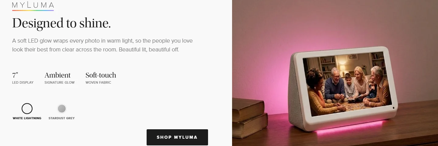
The demo’s MyLuma band by day: Designed to shine. in dark type on a white panel, beside a photograph of the frame on a desk, glowing pink.
Day · white matte, the default
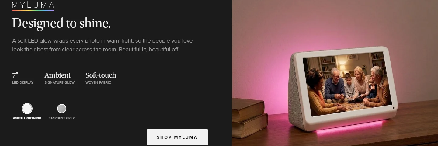
The same band at night: the panel is black and the type light; the photograph is the same.
Night · black matte, opt-in

Added for the demo: the night register, for low-light rooms. It is remembered once a visitor picks it, never forced by the device.

The page does what their frames do.

The method

Five layers, with the limits and the research behind eachShow all +Hide
  1. L0 Cognitive Load

    Free the working memory the reader needs to process the page at all.

  2. L1 First-Impression Architecture

    Clear the fifty-millisecond trust gate so attention switches on at all.

  3. L2 Processing Fluency

    Make the page easy to read so the content feels true.

  4. L3 Perception Bias Optimization

    Design for what the reader actually does, not what they would say they want in a focus group.

  5. L4 Decision Architecture

    Structure the page so the right action is the easiest action.

The framework, with its research and its limits

Result

Under five hours of work in total. With context engineering on my work folder for the brand, one prompt built the first version in about three hours; the polish, spread over two days, took the rest.

Perception-First Design™ consulting

For branding, brand development and marketing strategy.

Stefan Kovalik   San Francisco

Send me your site.

I’ll tell you what I’d change. No pitch, just an honest read. If it makes sense to work together, we will.

Weekday response within 48 hours.

I have room right now.