Methodology Work Services Book About Writing Make Me Think - chapters Methods Guide Notes Blog FAQ

Work / 01

01Reference build

Mehrwerk

B2B2C platform · 700+ people across Europe and the Americas

Information and messaging architecture a whole leadership team supports. Their web vendor is now implementing it.

“The work you’ve done has been super valuable in shaping our thinking.”
Mehrwerk, May 2026

March to June 2026 · captures taken 2026-09-28
Published with Mehrwerk’s permission.

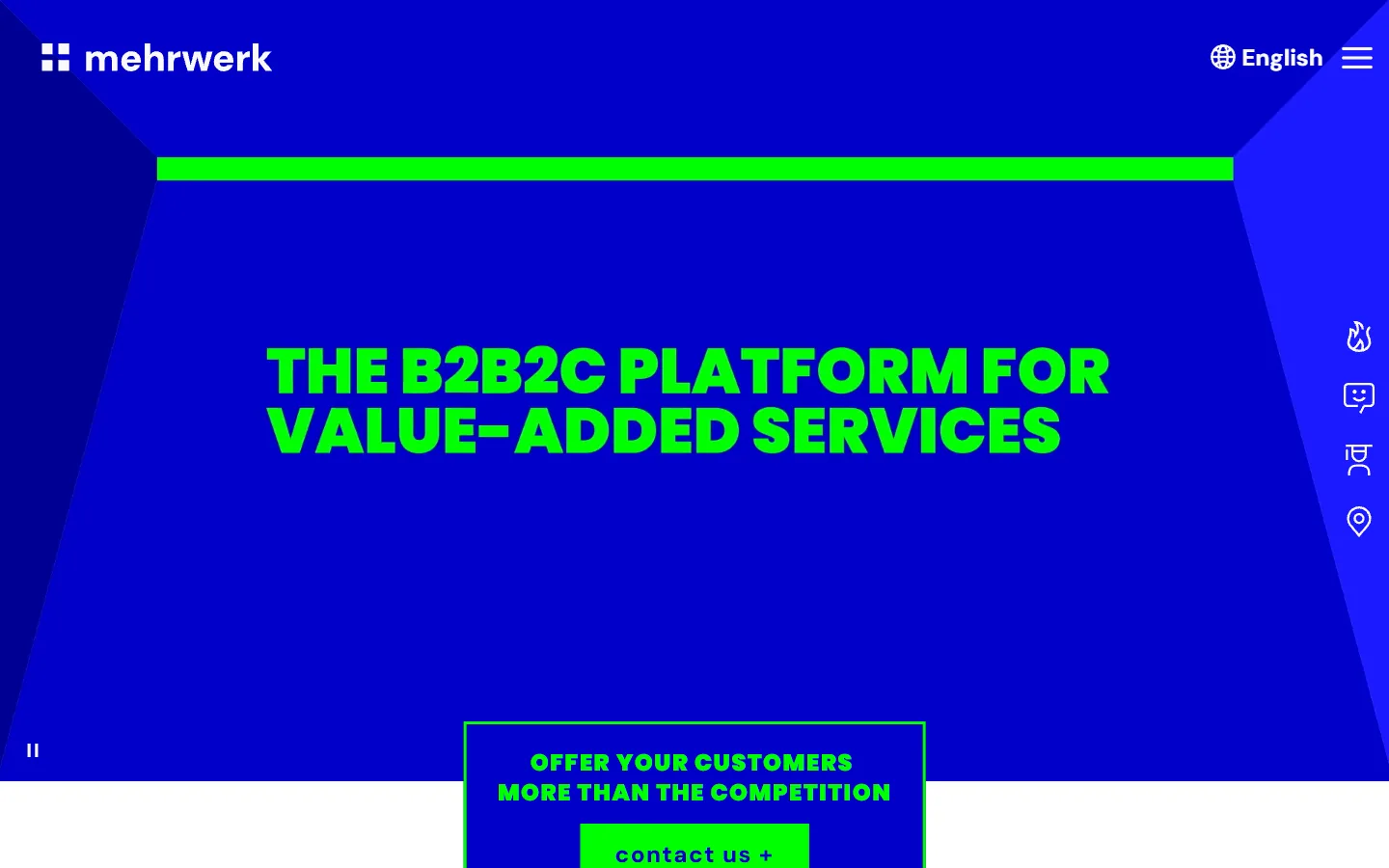
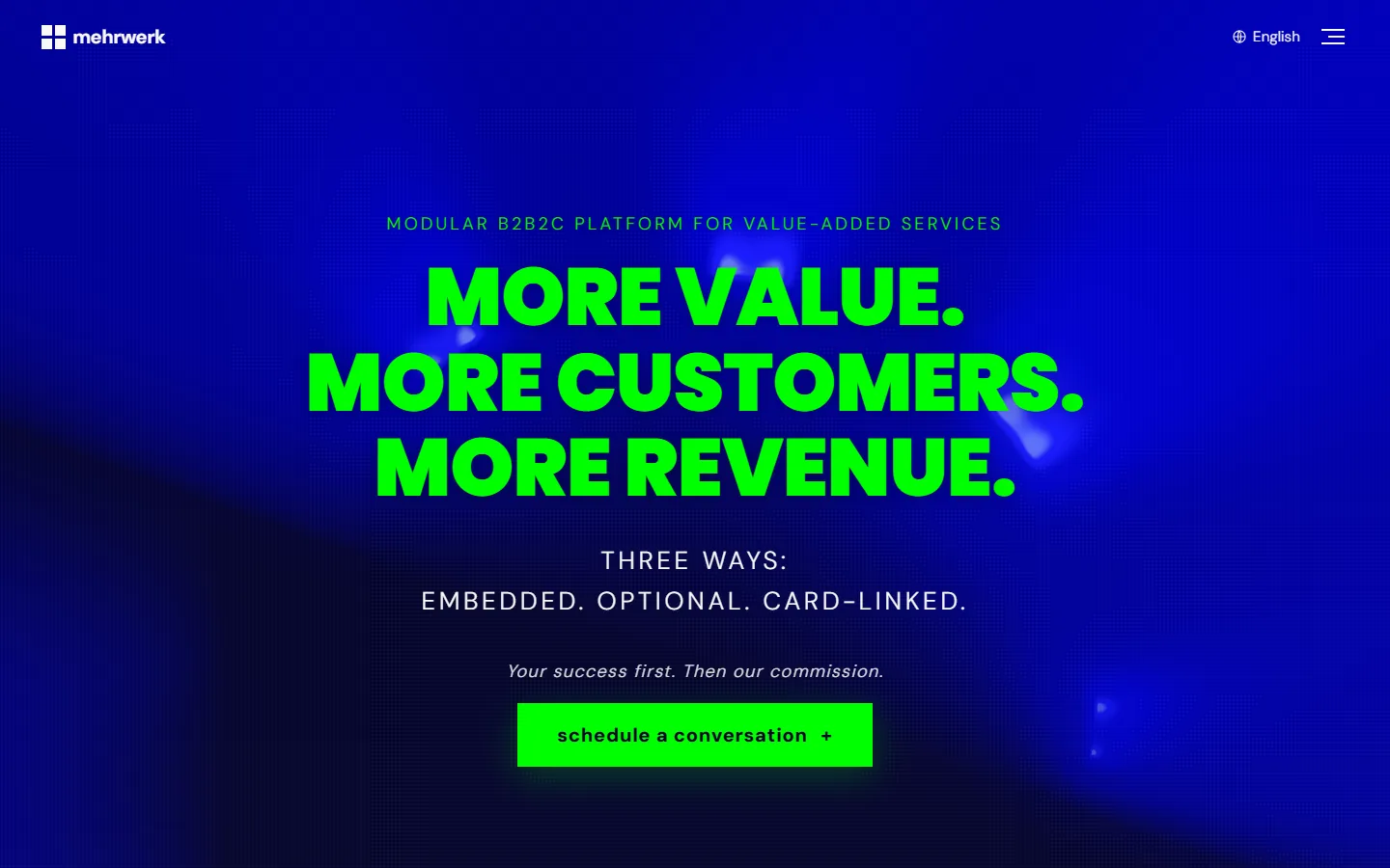
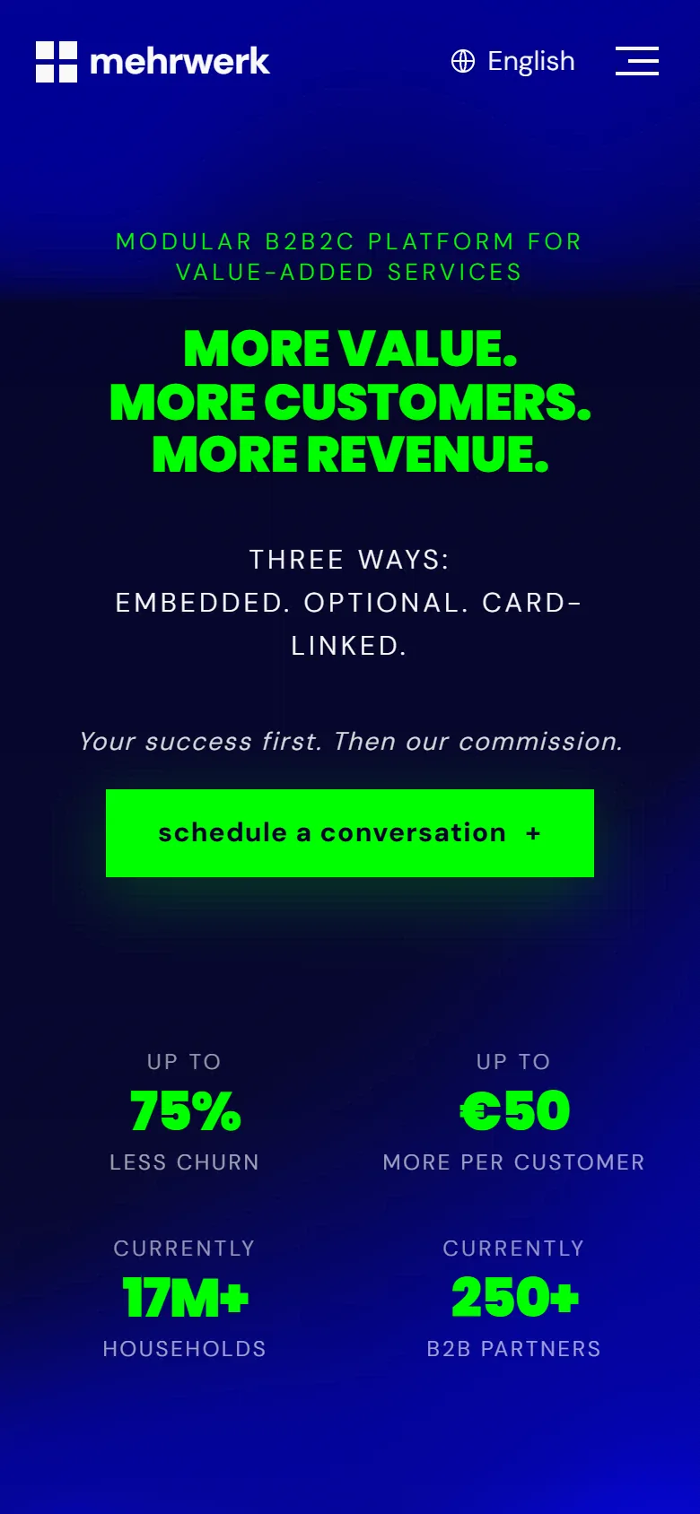
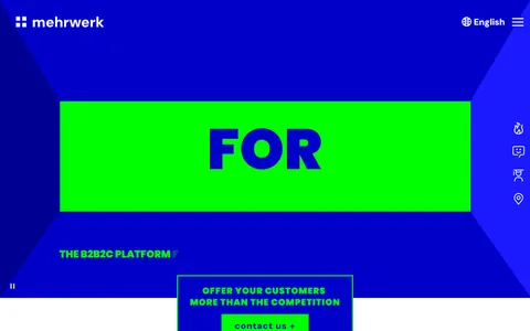
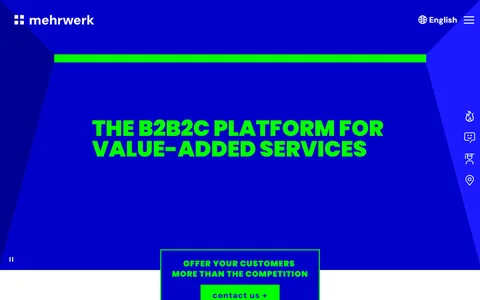
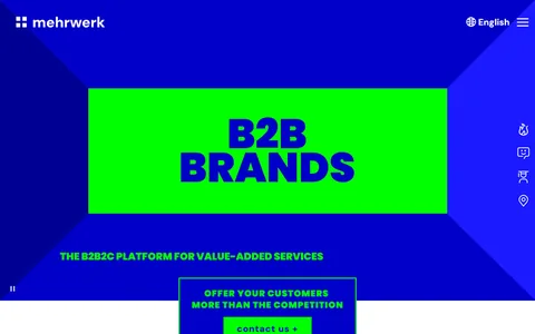
mehrwerk.com/en/ desktop first screen, captured 2026-09-28, at the moment its animated hero completes its tagline. The reference build desktop first screen: More value. More customers. More revenue. in green on blue, the three ways, and the schedule a conversation button.

Left: mehrwerk.com/en/ as it loads today, at the moment its animated hero completes its tagline. Right: the reference build, captured the same day at the same size. Both in English.

Cognitive psychology, not opinion

Why this homepage was built the way it was, in the rationale I delivered to Mehrwerk.

What the design aimed for

Pre-verbal arousal: the nervous system registering trust, relevance, and forward momentum before the analytical mind engages.

For Mehrwerk: a buyer registers “a real platform for companies like mine” within 50 milliseconds.

Checkpoint 01 · First 50 milliseconds

“What is this, and is it worth my attention?”

The visitor has not started reading yet. The page either registers as “a real platform for companies like mine” or as “something I should scroll past.”

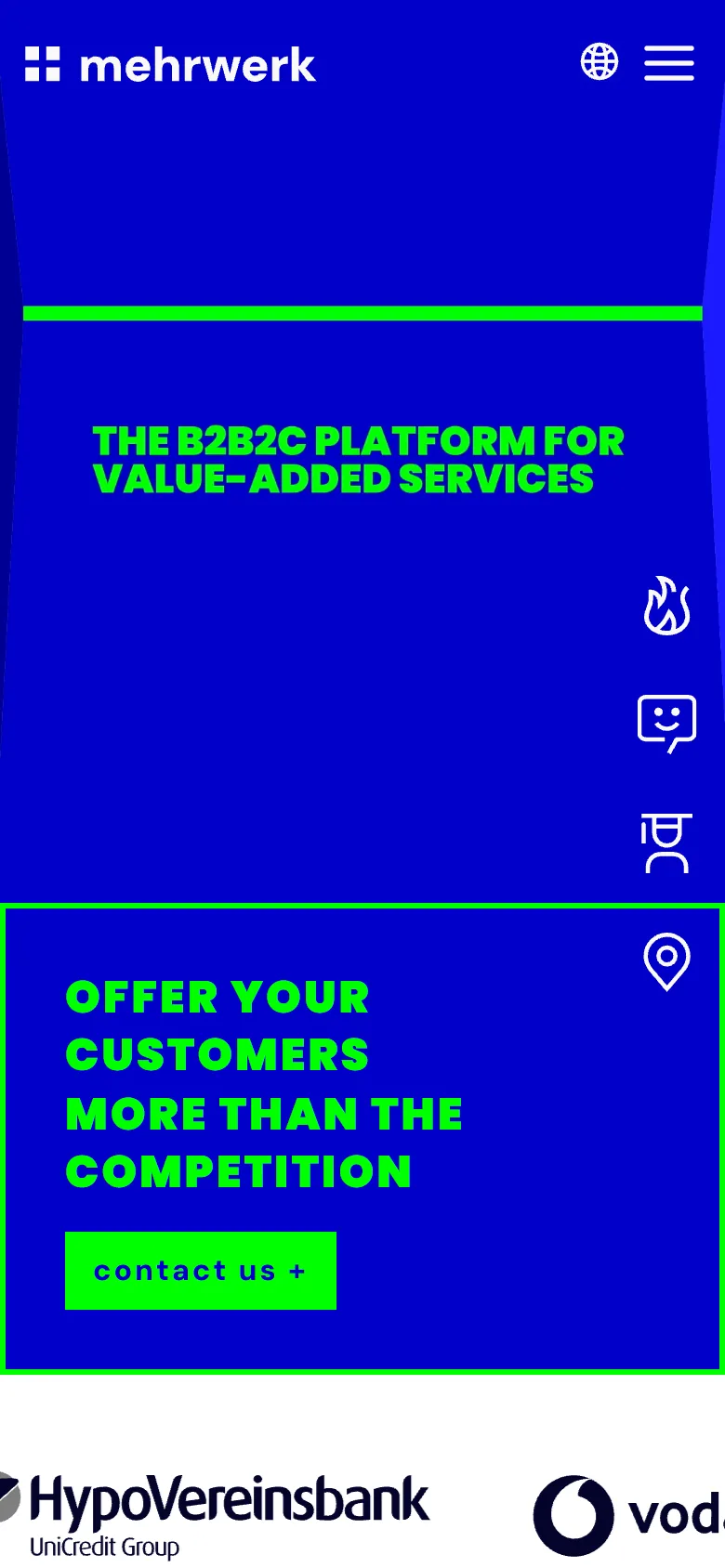
mehrwerk.com/en/ first screen on a phone, captured 2026-09-28. The reference build first screen on a phone: More value. More customers. More revenue.
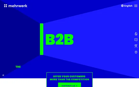
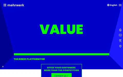
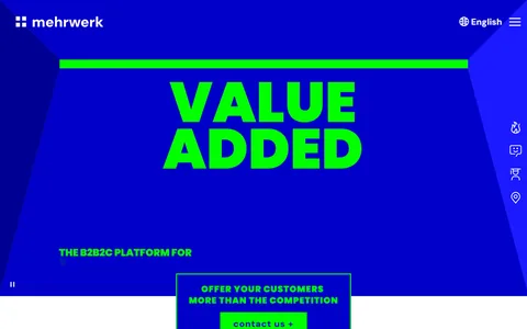
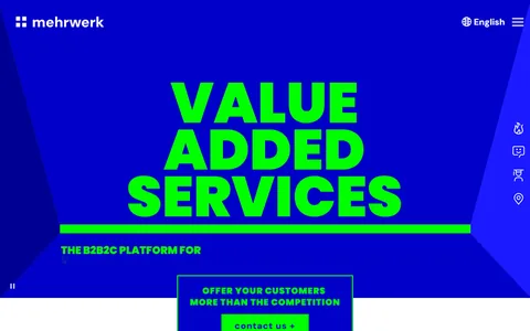
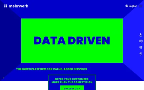
  1. mehrwerk.com/en/ desktop first screen at 1.4 seconds
    1.4 s
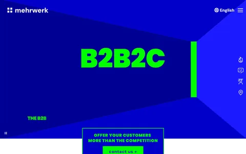
  2. mehrwerk.com/en/ desktop first screen at 1.8 seconds
    1.8 s
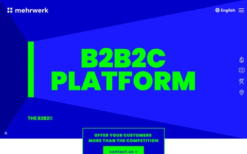
  3. mehrwerk.com/en/ desktop first screen at 2.2 seconds
    2.2 s
  4. mehrwerk.com/en/ desktop first screen at 3.0 seconds
    3.0 s
  5. mehrwerk.com/en/ desktop first screen at 3.4 seconds
    3.4 s
  6. mehrwerk.com/en/ desktop first screen at 3.8 seconds
    3.8 s
  7. mehrwerk.com/en/ desktop first screen at 4.6 seconds
    4.6 s
  8. mehrwerk.com/en/ desktop first screen at 5.4 seconds
    5.4 s
  9. mehrwerk.com/en/ desktop first screen at 7.0 seconds
    7.0 s
  10. mehrwerk.com/en/ desktop first screen at 9.0 seconds
    9.0 s
  11. mehrwerk.com/en/ desktop first screen at 11.0 seconds
    11.0 s
  12. mehrwerk.com/en/ desktop first screen at 13.0 seconds
    13.0 s

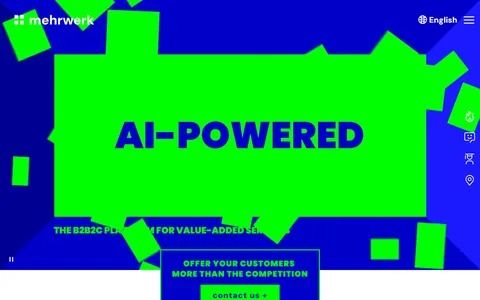
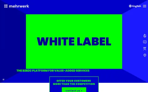
Left: the same two first screens on a phone. Right: their desktop first screen between 1.4 and 13 seconds, as the message arrives a word or two at a time. Captured 2026-09-28.

Decisions

Eyebrow line above the headline

L1 First-Impression Architecture

Clear the fifty-millisecond trust gate so attention switches on at all.

L0 Cognitive Load

Free the working memory the reader needs to process the page at all.

“Modular B2B2C Platform for Value-Added Services” lands with the logo, so a visitor knows what kind of company this is before reading the headline.

Outcomes-led headline, not capability-led

L3 Perception Bias Optimization

Design for what the reader actually does, not what they would say they want in a focus group.

“More value. More customers. More revenue.” matches the prediction a buyer arrives with instead of violating it.

Green for the message and the one action

L2 Processing Fluency

Make the page easy to read so the content feels true.

In the hero, the eyebrow, the headline, the proof numbers and the button are Mehrwerk green; the rest is off-white on blue, so the eye goes to what you get and what to do.

What their video said in 30 seconds, the headline says at once

L1 First-Impression Architecture

Clear the fifty-millisecond trust gate so attention switches on at all.

L0 Cognitive Load

Free the working memory the reader needs to process the page at all.

I didn’t write new messaging. I took what their 30-second video spelled out word by word, and what the leadership already had, and set it as the headline and text.

What should change

Visitors should place Mehrwerk as a “peer-grade B2B platform” within the first page load, and warm traffic from the partner network should recognize it on arrival.

Check after launch: homepage bounce rate, against the current site.

Paste-ready line

“The first fifty milliseconds is when visitors decide whether the site is worth their attention. I engineered that fifty milliseconds.”

Checkpoint 02a · First 30 seconds

“Is this real, and is it for us?”

The visitor has committed to reading. They need proof that Mehrwerk actually operates at the scale the hero claims, and a way to see their own business inside the model.

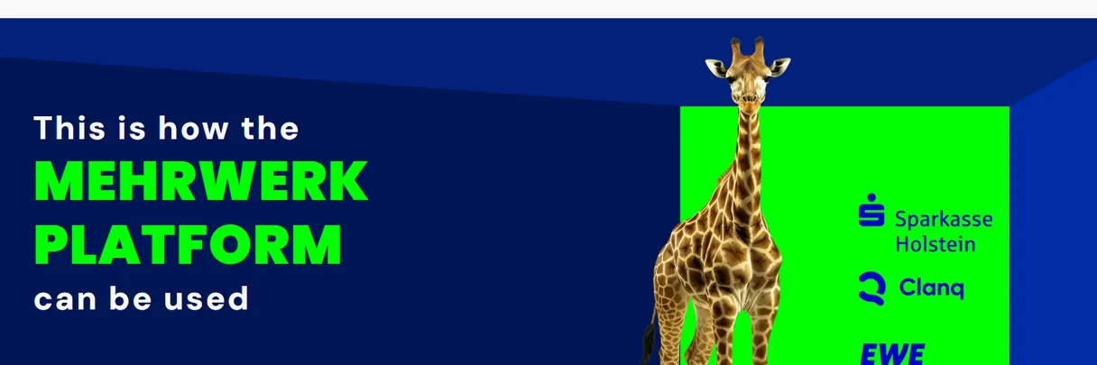
mehrwerk.com today: This is how the Mehrwerk platform can be used, a paragraph and three case buttons.
BeforeTheir site today: how the platform can be used, told in a paragraph, with three cases behind + buttons. Captured 2026-09-28.Their site today on a phone: how the platform can be used, told in a paragraph, with three cases behind + buttons. Captured 2026-09-28.
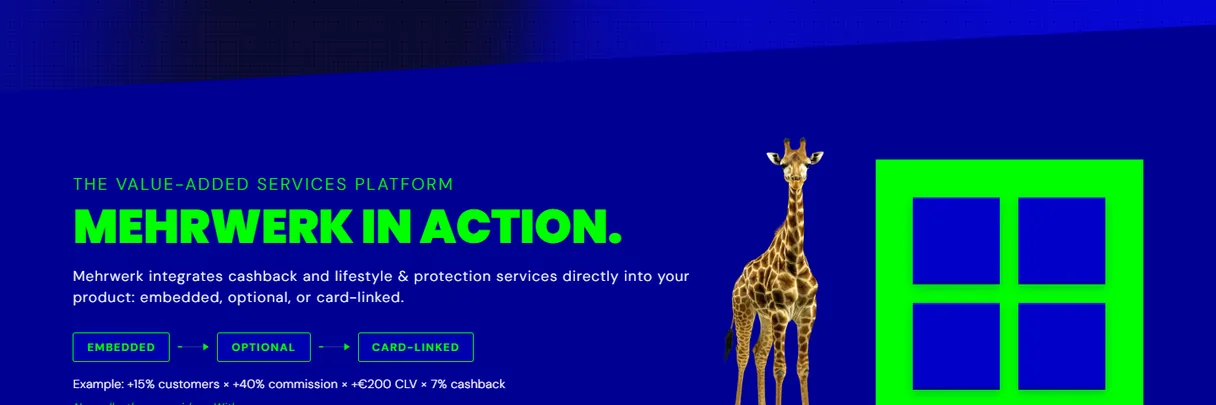
The reference build: Mehrwerk in action, three ways (embedded, optional, card-linked), each shown inside an end customer app. Gold markers 1 and 2 point at the decisions below.
AfterThe reference build: the three ways, in three bites.The reference build on a phone: the three ways, in three bites.

Decisions

1

Three-way chunking

L0 Cognitive Load

Free the working memory the reader needs to process the page at all.

Embedded. Optional. Card-linked. Three bites instead of a paragraph, inside the three to five items working memory holds.

2

Each way shown inside the end customer’s app

L4 Decision Architecture

Structure the page so the right action is the easiest action.

The three ways are shown the way the buyer’s own customers would meet them: a premium account that counts the month’s savings, an offer when a flight is booked, a card that pays back on its own.

What should change

Buyers should be able to qualify themselves inside the first thirty-second read, with the commercial question already half-answered.

Check after launch: the share of visitors who scroll past the three ways.

Checkpoint 02b · First 30 seconds

“Does this apply to me?”

The second half of “Is this real, and is it for us?”: the visitor needs a way to see their own business inside the model.

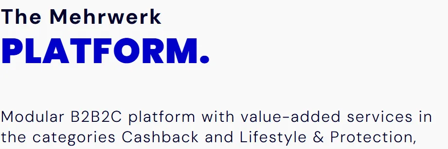
mehrwerk.com today: The Mehrwerk platform section, a paragraph and a small diagram of categories.
BeforeTheir site today: mehrwerk.com/en/, the platform section. Captured 2026-09-28.Their site today on a phone: mehrwerk.com/en/, the platform section. Captured 2026-09-28.
The reference build: value-added services drawn as demand meets supply, then one client result per way. Gold markers 1 and 2 point at the decisions below.
AfterThe reference build: six industries feed the platform on the left; households, partners and countries sit on the right; below it, one client result for each way.The reference build on a phone: six industries feed the platform from above; households, partners and countries sit below; then one client result for each way.

Decisions

1

Demand meets supply, drawn

L3 Perception Bias Optimization

Design for what the reader actually does, not what they would say they want in a focus group.

L0 Cognitive Load

Free the working memory the reader needs to process the page at all.

Six industries on one side, households and partners on the other, the platform in the middle.

2

A named client and result for each way

L3 Perception Bias Optimization

Design for what the reader actually does, not what they would say they want in a focus group.

EWE runs it embedded, auxmoney optional, clanq card-linked, each with one result beside its name, so a buyer finds the way that matches their own product.

What should change

Visitors who aren’t a fit should be able to tell early and leave before they take up sales time, so the sales team works a pipeline with less noise.

Check after launch: the share of contact requests the sales team rates as a fit.

Paste-ready line

“The proof layer answers ‘is this real, and is this for us?’ without a salesperson having to be in the room.”

Checkpoint 03 · The full session

“Is this the kind of company I want to work with?”

Trust is cumulative. Every inconsistency, every cognitive re-calibration, every moment of “huh?” is a small withdrawal from the trust account built in the first thirty seconds.

mehrwerk.com today: the contact block with photo cards of the CEO and two department heads.
BeforeTheir site today: the contact block. Captured 2026-09-28.Their site today on a phone: the contact block is a sideways carousel, one person at a time, with the next card cut off at the edge. Captured 2026-09-28.
The reference build: three paths, become a customer, become a partner, become a Mehrwerker, each with its next step. Gold marker 1 points at the decision below.
AfterThe reference build: three paths at the decision point.The reference build on a phone: three paths at the decision point.

Decisions

1

Each path names its next step

L4 Decision Architecture

Structure the page so the right action is the easiest action.

Their cards put three named people forward, with photos, as the contacts. Here each path names its next step instead: “book a call”, “start a partner conversation”, “see open roles”.

What should change

A visitor who reaches the “schedule a conversation” button should have met nothing that made them stop and re-read. The decision to reach out should feel earned, not pushed.

Check after launch: how many visitors who reach the contact section start a conversation.

Paste-ready line

“Trust is not built at the CTA. It is built in every pixel between the first impression and the decision.”

The brand, kept and put to work

Their colors, typefaces, button and motifs, carried into a new homepage.

From the delivered rationale: the new homepage rebuilds the first two checkpoints “without touching the brand’s established voice or color system.”

Their brand today

Mehrwerk brand today: the mehrwerk logo; palette #04042A, #0000C8, #00FF00, #F9F9F9; type Poppins for headlines and DM Sans for text; the green contact us + button; motifs, the giraffe and the angular cut.

Their giraffe, green box and angular cut

The giraffe, the green box and the angled section edge from mehrwerk.com, carried into the new homepage’s platform section.

mehrwerk.com today: the giraffe beside a green box on blue.
mehrwerk.com today
The new homepage: the giraffe and green box in the platform section.
Applied in the new homepage

Angular clip paths as brand grammar

L2 Processing Fluency

Make the page easy to read so the content feels true.

The diagonal cuts are the signature Mehrwerk already uses in its logo system, carried into the page structure.

Their two categories

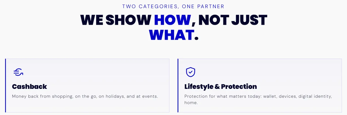
Their own sentence names Cashback and Lifestyle & Protection; the new homepage gives the two categories their own section.

mehrwerk.com today: the sentence naming Cashback and Lifestyle and Protection.
mehrwerk.com today
The new homepage: a section for the two categories, Cashback and Lifestyle and Protection.
Applied in the new homepage

Their button

Green, with the plus, as on mehrwerk.com (“contact us +”), applied to the new homepage’s main call to action.

mehrwerk.com today: the green contact us + button.
mehrwerk.com today
The new homepage: the green schedule a conversation + button.
Applied in the new homepage

Added for the new homepage: a moving hero background, phone and card mockups, two tints of their blue.

A new first impression without a rebrand.

The method

Five layers, with the limits and the research behind eachShow all +Hide
  1. L0 Cognitive Load

    Free the working memory the reader needs to process the page at all.

  2. L1 First-Impression Architecture

    Clear the fifty-millisecond trust gate so attention switches on at all.

  3. L2 Processing Fluency

    Make the page easy to read so the content feels true.

  4. L3 Perception Bias Optimization

    Design for what the reader actually does, not what they would say they want in a focus group.

  5. L4 Decision Architecture

    Structure the page so the right action is the easiest action.

The framework, with its research and its limits

Result

Their web vendor is now implementing it on the architecture I defined.

Paid engagement: a homepage concept, a reference build and a public design rationale.

Perception-First Design™ consulting

For branding, brand development and marketing strategy.

Stefan Kovalik   San Francisco

Send me your site.

I’ll tell you what I’d change. No pitch, just an honest read. If it makes sense to work together, we will.

Weekday response within 48 hours.

I have room right now.